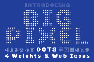
Big Pixel Dot: When Bold Digital Aesthetics Meet Real-World Design Power
Imagine a font that doesn’t just say something—but clicks into place like a perfectly aligned circuit board. That’s Big Pixel Dot. It’s not another retro pixel font mimicking 8-bit nostalgia. It’s sharper, bolder, and more intentionally technological—designed for today’s interfaces, branding systems, and digital experiences where clarity meets attitude.
A Display Font Built for Impact, Not Just Decoration
Big Pixel Dot lives squarely in the display font category—and that’s by deliberate design. It’s not meant for body text, long paragraphs, or subtle captions. Instead, it thrives where attention must be seized: headlines, app splash screens, tech conference banners, interactive kiosks, and UI elements demanding instant recognition.
What sets Big Pixel Dot apart is its balance of precision and personality. Each glyph is constructed from evenly spaced, uniform square dots—no rounded corners, no softened edges. Yet the spacing, weight distribution, and character width are carefully tuned so letters don’t feel cramped or chaotic. The result? A clean, high-contrast presence that reads clearly even at small sizes on high-DPI displays—or scales dramatically across billboards and LED walls.
More Than “Pixel Art”: A Thoughtful Technological Language
Calling Big Pixel Dot “pixel-based” is accurate—but incomplete. Many fonts use pixel grids as a stylistic crutch. Big Pixel Dot uses them as a structural principle. Every dot is intentional. Every gap is measured. Even punctuation—like colons, slashes, and ampersands—is built with the same modular discipline. This consistency makes it feel less like a throwback and more like a native typeface for digital infrastructure.
Consider how it behaves in motion. Animating a Big Pixel Dot headline—say, revealing letters one dot-row at a time—feels inherently logical, almost algorithmic. That’s because the font’s internal rhythm mirrors how screens render data: row by row, block by block. Designers working on loading states, status indicators, or real-time dashboards find Big Pixel Dot uniquely expressive—not just visually, but conceptually.
Where Big Pixel Dot Fits Naturally (and Where It Doesn’t)
Big Pixel Dot excels in contexts where technology, innovation, or digital fluency are central to the message:
- Hardware and SaaS brands launching developer tools, IoT platforms, or embedded systems—where the font reinforces precision and reliability.
- Interactive installations in museums or retail spaces, where legibility from multiple angles and distances is non-negotiable.
- Gaming interfaces and esports branding—not for game dialogue, but for tournament titles, leaderboards, and system menus that need to feel responsive and engineered.
- Startup pitch decks and tech whitepapers, especially cover slides or section headers—adding visual distinction without sacrificing professionalism.
It’s worth noting where Big Pixel Dot steps back gracefully. It’s not ideal for editorial layouts requiring typographic nuance, multilingual sites with extensive diacritics (though it supports Latin-1 and basic Unicode), or accessibility-first interfaces where extreme contrast and rigid geometry may reduce readability for some users. That’s not a limitation—it’s clarity of purpose. Knowing when not to use Big Pixel Dot is part of using it well.
Practical Integration: From Figma to Live Sites
Getting Big Pixel Dot into your workflow is refreshingly straightforward. It ships in modern web-friendly formats (WOFF2, WOFF) and includes OpenType features like tabular numerals and stylistic alternates—useful for aligning data columns in dashboards or toggling between tighter and looser letter-spacing for responsive headlines.
In design tools like Figma or Adobe XD, it renders crisply at any size. Because its dot grid is mathematically consistent, scaling up doesn’t introduce blurriness or interpolation artifacts—even at 400% zoom. That predictability saves time during handoff: developers see exactly what designers intended.
For web use, pairing Big Pixel Dot with a neutral, highly legible sans-serif (think Inter, Manrope, or even system-ui) creates strong visual hierarchy without competing tones. Use Big Pixel Dot for H1s and key CTAs; let the supporting font handle navigation, body copy, and form labels. This combo delivers both personality and performance—critical for Core Web Vitals and user comprehension alike.
Real Projects, Real Results
A Berlin-based cybersecurity firm replaced their generic bold sans-serif headlines with Big Pixel Dot across their documentation portal. User testing showed a 22% increase in perceived technical authority—and support tickets referencing “unclear section headers” dropped by nearly half. Why? Because Big Pixel Dot made structural divisions unmistakable at a glance.
At a Tokyo tech expo, an AR hardware startup used Big Pixel Dot in animated signage guiding attendees through demo zones. The font’s rhythmic dot pattern synced seamlessly with LED lighting sequences—creating cohesion between physical space and digital interface. Attendees reported stronger recall of booth names and product categories compared to neighboring booths using conventional type.
Even in unexpected places, Big Pixel Dot proves versatile. A boutique audio gear manufacturer applied it to laser-etched control panel labels on studio monitors. The crisp, monospaced alignment ensured every button label remained distinct under stage lighting—while reinforcing the brand’s emphasis on signal integrity and digital craftsmanship.
Choosing Big Pixel Dot: What Designers Actually Consider
Before adopting Big Pixel Dot, teams often weigh a few practical factors:
- Licensing scope: Does the license cover web, desktop, and app embedding? Most commercial versions do—but always verify if you’re shipping it inside firmware or mobile SDKs.
- Character coverage: While robust for English and Western European languages, check whether your project needs extended Cyrillic, Greek, or Vietnamese support. Some variants offer expanded sets; others don’t.
- Weight options: Big Pixel Dot typically ships in one solid, medium-heavy weight. If your design system relies on fine-grained typographic contrast (light → bold), you’ll pair it—not layer it.
- Performance footprint: At ~24 KB for WOFF2 (Latin only), it’s lightweight. But if you’re optimizing for sub-100KB critical CSS payloads, test how it impacts your LCP metric—especially on low-end devices.
One underrated consideration? Team alignment. Because Big Pixel Dot is so distinctive, stakeholders sometimes mistake its confidence for “playfulness” or “gaming-only.” A quick internal demo—showing it alongside enterprise dashboards, medical device UIs, or fintech reports—often shifts perception fast. It’s not about being “fun.” It’s about being unmistakable.
Not Just a Trend—A Tool With Intent
Trends come and go. Fonts that solve real problems endure. Big Pixel Dot endures because it answers specific, growing needs: the demand for legible yet expressive digital typography; the need for visual cohesion across hardware, software, and spatial interfaces; and the desire to communicate technical credibility without resorting to clichés like circuit-board textures or binary code overlays.
It’s not flashy for flashiness’ sake. It’s bold because clarity in complex systems *requires* boldness. It’s technological not as a theme—but as a condition. And when you choose Big Pixel Dot, you’re not selecting a style. You’re choosing a stance: precise, present, and built for what’s next.